THE SAFER WAY TO CUT.

THE SAFER WAY TO CUT.
MARTOR is the international brand that combines efficient cutting and work safety like no other manufacturer. We do this by focusing on the essentials: on you and your needs, making things easier for you and giving you added value. Our brand identity also means never standing still on innovation and quality standards. We aim to impress – with high-quality products, unique services and a unified brand look. Our mission, to make the world of work safer, is also reflected in our new slogan: THE SAFER WAY TO CUT.
OUR BRAND
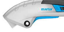
Experience proven quality also with the design. Clear lines, distinctive shapes and consistent colours characterize the appearance of our brand. Our logo is a very good example for the look. The truncated “a” gives you a first impression of our business: professional cutting tools to increase work efficency and safety in the workplace.
OUR PRODUCT LOOK
Our company colour is blue, cyan to be precise. That was always the case for our logo, but not for our products. We have changed that now. The product parts that were red now shine brightly in fresh cyan. This will not impact the quality of our products. But it will help you to recognise MARTOR at first sight.
OUR PRODUCT NAME SYSTEM
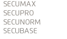
When it comes to cutting tools, MARTOR has the right solution for everyone. Our name system helps you to find the most suitable product even faster. Example safety knives: For better guidance all product names start with a group name that provides information on the safety technology and thus on the degree of work safety: SECUMAX, SECUPRO, SECUNORM and SECUBASE.
OUR PICTOGRAMS
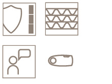
Another piece in the jigsaw, in order to familiarize with our products even more quickly. We have allocated pictograms to all our cuttings tools, stating information about 1. technical characteristics, 2. main cutting materials, 3. fitting accessories and 4. our services. Ideal to use for a quick product comparison. By the way: the four icons shown are only a small example excerpt of our pictogram system.
 title
title